
The National Park Service's centennial logo is uninspiring.
National parks, it's held up, are "America's best idea," but logos chosen for the National Park Service to celebrate its centennial and to use in other venues fail to reflect that belief. Indeed, they ignore the rich heritage and beauty of the National Park System in a curious attempt to "engage and connect with new audiences."
With a landscape of more than 84 million acres containing such world-famous icons as Old Faithful, Half Dome, and the Grand Canyon, historic sites that trace the birth and evolution of the United States, and poignant settings that recall Americans' heroism, the creative possibilities to entice visitors of all ages into the National Park System and celebrate the Park Service's stewardship of these lands are many. Millennials, studies show, want to be entertained and educated with meaningful content, yet these evocative and inspiring images and themes are absent from the logos.
While individual units of the park system capture elements of their heritage in their own commemorative logos, the multi-million-dollar campaign to celebrate the Park Service's 100th birthday in 2016 took the agency's iconic arrowhead logo, stripped it bare, and colored it green.
Park Service officials, and those with Grey New York, which is handling the centennial campaign, offer that simpler is better when trying to connect the Millennial generation with national parks.
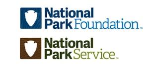
What's the message? What's the connection?
Ken Dowling, a partner at Grey, said earlier this year that new logos that put the Park Service and its charitable fund-raising arm, the National Park Foundation, on the same platform were designed to introduce Millennials to the parks.
'I don't think it's been on the Millennials' radar," Mr. Dowling told AdWeek. An interview request Friday was not granted.
A somewhat similar intent -- to reach audiences younger than Baby Boomers -- was voiced by Park Service spokeswoman April Slayton when asked what message the Centennial logo was striving to impart.
"The Centennial logo provides a fresh new look as we engage and connect with new audiences while celebrating this milestone," she wrote in an email. "The design, which incorporates the arrowhead shape, reflects the style of the new National Park Service logo that was announced earlier this year to accompany the traditional arrowhead in the NPS visual identity. Neither addition replaces the arrowhead. Instead, they provide the National Park Service and its partners with the flexibility to use the logo in circumstances where the arrowhead may not be appropriate."

"Celebrate Our Past, Inspire Our Future"
But in reaching for a "fresh new look," the ad agency produced a bland, aseptic image that offers no tangible connection to the national parks. The logos spark no wonderment, inspire no exploration, and overlook why the parks are hailed as America's best idea. They fail to so much as hint at the incredible diversity, history, and awe of the American landscape contained within the park system.
At Rocky Mountain National Park, which marks its centennial in 2015, the official logo connects "Wilderness, Wildlife, Wonder" to the landscape with images of bighorn sheep, snow-clad mountains, and pine cones. A logo for Acadia National Park's centennial in 2016 not only urges us to "Celebrate Our Past, Inspire Our Future," but features a view from atop one of the park's granite-domed mountain trails with views out to Frenchman Bay.
Understandably, individual parks have limited focus around which to build their logos. The National Park System covers more than 400 units, and it wouldn't be realistic to try to capture all visages in one logo for the National Park Service.
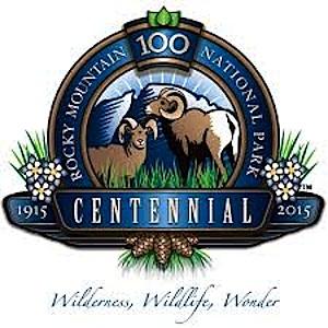
"Wilderness, Wildlife, Wonder"
But there is nothing in the Centennial logo that speaks either to the agency's first 100 years or looks forward to the next. And while Ms. Slayton said the two (very, very similar) shades of green in the logo "tie together the robust history of the National Park Service and the energy and excitement of the Centennial celebration," that connection is hard, if not impossible, to visualize.
While a centennial celebration is quickly over, and so the 2016 Centennial logo might be viewed as just a throw-away, the remaining logos Grey has left with the Park Service and Park Foundation go equally begging for explanation. They fail to connect with the parks, largely fail to distinguish the two entities from one another, and seem to be little more than a marketer's creation for licensing products.
Coca Cola admitted it made a mistake when it tried to replace the original recipe back in 1992 -- much to public rejection -- and it was deemed a marketing failure. It's not too late to develop a meaningful set of logos for the Park Service. The national parks, and the National Park Service, merit better.

 Support Essential Coverage of Essential Places




Comments
It is bland and empty. I want to know how much of our taxpaying money was spent with this ad firm. This is a classic example of why folks should not hand over money to the NPS. They are striving to entice Millenials into the parks and at the same time are raising fees to enter parks and dropping visitation in the process. But they are using fee monies on stupid, empty designs? This is Jarvis NPS and a perfect example of bureacratic logic. Perhaps his brother is now a lobbyist for the ad agency, who knows.
Spot on, Kurt. Those comments about the logo are eerily similar to the balderdash heard back in 1969 when Nixon tried to modernize the Arrowhead.
No offense Kurt, I realize you probably haven't worked in the graphics and media world, but the acadia and rocky mountain logos wouldn't work very well in the print world where a logo has to be scaled out for usage on multiple different media materials, and then applied to countless souveniers. The logos are too busy and have too many colors. Try crushing those logos into a small space like what you see in the logo above that shows "National Park Foundation" and "National Park Service" where the logo is to the side and in a square less than 1/4 inch by 1/4 inch. Try crushing those onto a lapel pin that is only 1 inch by a 1/2 inch, or onto a mug that will only handle 4 colors on their printers. It would be completely unlegible in those formats and look like a blur.
And Quillen, even if they spent 2 million on it, and turn around and sell 100 million worth of souviniers sold at 400 different sites, the parks will still reap benefits off of the initial investment.
I'm not a fan of the blank arrowhead, but i'm sure they tried putting things in that space, and realized it would be better off blank, and they are trying to make the arrowhead the "icon". The arrowhead is an iconic symbol that does represent the parks. What's the alternatives? At best they may have fit "NPS" in the arrowhead, if you display it next to the words, as seen in the picture above. But then again what is more reconginzable to most people that have visited our parks, the arrowhead seen at most gate areas when you enter the park, or the words "NPS".
They state in this very article that this doesn't replace the current traditional arrowhead with the buffalo, sequoia treeI and mountain backdrop. It's just a simplified version that is used when that logo doesn't work. And yes, when you scale that logo down, it doesn't look good since that logo itself is busy. If you are going to snipe, you better have some workable alternatives that make more sense.
I agree with Gary. A logo is not a billboard and certainly not a mural. What is pretty up big is rarely usable small. My concern about the centennial is not the logo but rather the events. Will they be predictable, bland, and PC or meaningful, stirring, and memorable? I suspect that the grousing about the logo has more to do with our suspicions there. We already see those insisting that we subdivide our great idea by interest groups. A centennial celebrating our collective wisdom and achievement is the last thing those folks have in mind. And so we dump on the logo. Well, let us have the courage to dump on the rest of it, too.
Dr; Runte--I have been worried for a long time that the centennial will end up as nothing more than a brief celebration and little else. It should be a time when the NPS reflects upon its park areas and programs and establishes a clear vision for the future. I don't see much push in that direction in the centennial planning to date.
As for the logo, count me in as one who dumps on it, also.
Rick
Rick and Dr. Runte, your posts just made me realize that I've heard almost nothing about plans for the Centennial. Yeah, just what is planned?
Nothing is more thankless than dealing with opinions about logos, and new logo design.
I have been involved in the development of several, and often the overwhelming onslaught of opinion is absurd in the extreme. I worked with one brilliant graduate of the Harvard Graduate School of Design, who about 20 years ago was trying to guide some partners and NPS people through a logo review process, and i swear she was inches away from turning her back on any further dealings with park sentimentalists. Everyone was trying to cram all these literal doodles to mean different aspects of what they thought made the parks or preservation important. AND, of course, nobody agreed with anybody else's opinions, but you can be sure, all the opinions were deeply felt and banal. Our brilliant colleague from Harvard made all of us swear that we would NEVER put her through discussions about logos with non-designers AGAIN.
1. It was George Hartzog, Lee, not Richard Nixon, who tried to change the NPS logo before. The arrowhead officially had not been around for much more than 10 years when he tried to find something simple and modern and strong to replace what looked to him and Secretary Udall as a design hodge podge, a collection of trinkets all encased within, inexplicably, an arrowhead. Hartzog and Udall went through the same storm of passion. At least at the end of that process the NPS ended up with the famous "grid" design for the park brochures, a design that has lasted for years and which by the way has many of the distinctive qualities of quality design missing in most of the NPS logo discussions.
2. Gary Wilson and Dr. Runte are right. The most successful logos are not collections of trinkets, are not charm bradelets, are not billboards. The most successful, most recognizable logo in the World is the Coca-Cola "wave." There is nothing explicit on it. It is simple. It is distinctive. There are no trees on it, or people making or drinking coke, or nothing about Coke original ingredients or magic formula. Just the three-color Wave. This Coke logo enjoys vast world wild subliminal recognition. So, people in the NPS who think a successful logo must be chock full of literal statements of philosophy or identity Are. Plain. Wrong.
3. Dr. Runte is also right that the real issue for the Centennial is the greatness of our collective achievement that is the park system. I would add, though, that the Centennial also should be about the greatness of the next exciting 100 years.
4. The disaster of the Centennial under Director Mary Bomar was that it had no higher or collective purpose. It was a hodge podge of projects with no unifying theme. You would never know when it was 'achieved' and you knew it would never bring the parks to the next level. The greatness about Mission 66 was that everybody knew what the objective was. That is why it achieved its objective (even if you don't think park facilities even then should be the focus of the meaning of national parks, you must admit Connie Wirth and company had the necessary discipline and focus.
5. Director Jarvis and his leadership group at the National Park Foundation have the same dilemma Bomar had: no big shot of federal money available if you don't lobby hard for it (and perhaps both good soldiers who feel they could not demand federal money at the level it would make a visible difference the way Connie Wirth did, or maybe they or their financial people lack the political imagination).
What that means is they must depend on projects funded by, or at least partly funded by, partners. This does not necessarily mean what Dr. Runte fears, that "interest groups" will run away with the Centennial, and by extension with the promise of the next 100 years. Partners throughout the history of parks can be even more zealous than NPS professionals. Many of the parks were established only because of park partners. And today, from the repair of the Washington Monument to the preservation of great swaths of land around Acadia NP, partners often understand parks and put their own blood and money into parks at least as well as professionals.
But, some 'special interests' of course are interested only in their own profit or exploitation of parks, so we all should understand Dr. Runte's fear. And the other, in some ways more realistic fear, that the National Park Foundation, on whom both Bomar and Jarvis lean, may lack the sort of magnificent vision, leadership and energy needed to captivate the whole Nation behind the National Parks and preservation programs. Or, the simple understanding that disciplined focus on one common theme for the next hundred years is essential to get past Bomar's unfocused hodge-podge.
6. But, as a strategy we would all do better to be as positive as possible. If the parks belong to the whole Nation, then the whole nation has a right to join in. Everybody who supports parks, and many others who are not yet dazzled at the greatness of the park idea. It makes sense, in these times of "Think Globally, Act Locally" for Mr. Jarvis and the Foundation to identify 100 compelling projects that capture the promise of the next hundred years, even if each project is locally driven by local partners and park people.
Provided, that is, that together they raise the parks and programs to the next level and with the strongest possible UNIFIED IDENTITY, point the way to a great future.
We will all love the logos if the Centennial is the brilliant initiation of the future that the parks deserve. We will be thrilled. Lets pull together.
Here's the problem in a nutshell. I worked for the NPS for 10 years until I gave up and moved on. In those ten years, myself and other "youthful folk" would continuessly bring forth ideas to upper management to engage our younger audiences. They were always shot down by the old coots in charge. Now, I know you old school, crusty green and grayers out there don't want to hear this, but most of our ideas that were shot down, involved using technology. Because guess what??? Kids and young adults USE TECHNOLOGY. I know, I know, I know, that you don't want to hear that and you think they should turn off their cell phones and smell the pine cones, but they won't. Cell phones and tablets and what ever other gadget comes along is here to stay, and it doesn't matter how much you stomp and shout, it's not going away. The best way to get young people to smell the pine cones is to engage them on their own turf. That's through inovative uses of the latest technology and smart devices. Until the old crusty coots in charge stop wasting millions of dollars on redesigning logos as a way to reach younger audiences (really??) and start spending that money in a way that's actually useful, my beloved national parks will continue to slide into an oblivian of irrelavancy. I think the old saying, adapt or die is appropriate to use for this issue.